
Introduction
The way people access the internet has changed dramatically over the past decade. Smartphones have become the primary device for browsing websites, shopping online, reading blogs and searching for local businesses. This shift has transformed the expectations of users, who now demand fast, intuitive and seamless browsing experiences regardless of the device they use. As a result, responsive web design has evolved from being a desirable feature to an essential component of every successful website. Businesses that prioritize mobile-first design are better positioned to engage users, improve search engine rankings and achieve long-term digital growth. Whether you own a small business, manage an E-Commerce store or operate a corporate website, understanding why mobile-first matters is crucial for staying competitive in today's digital landscape.
What Is Responsive Web Design?
Responsive web design is a modern web development approach that enables a website to automatically adapt its layout, content and visual elements to different screen sizes and devices. Instead of creating separate versions of a website for desktop and mobile users, responsive design ensures that a single website delivers an optimized experience across smartphones, tablets, laptops and desktop computers. Flexible grids, scalable images and adaptive layouts work together to provide consistent functionality and readability. This approach not only simplifies website management but also ensures visitors enjoy a seamless browsing experience regardless of how they access the website.
Understanding the Mobile-First Approach
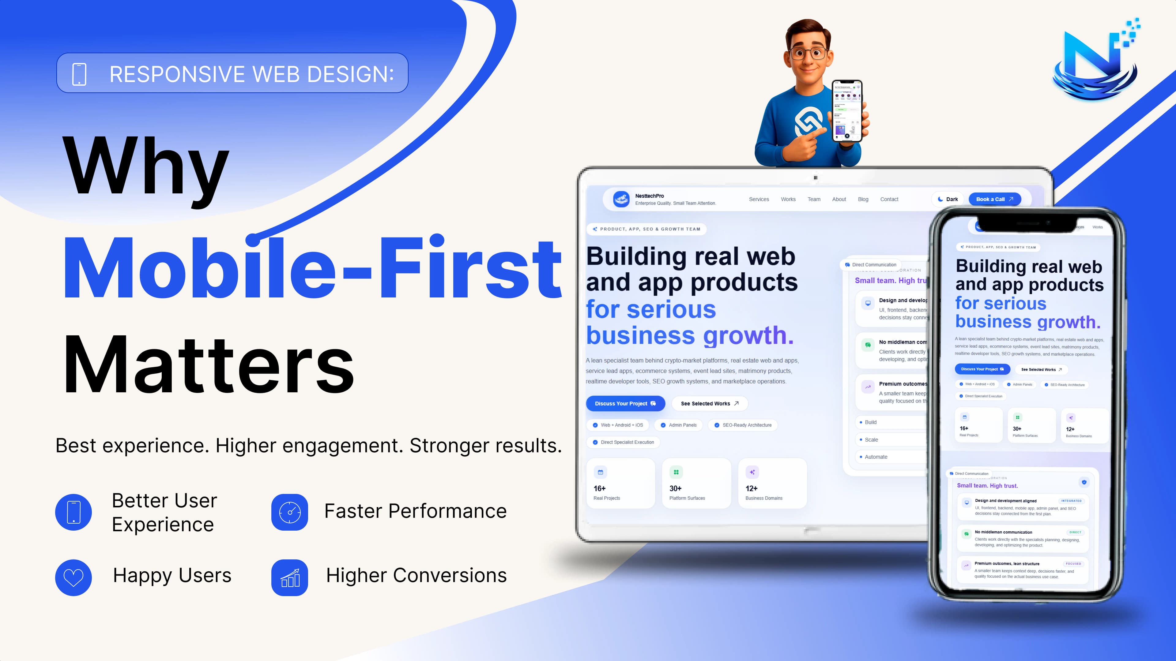
Mobile-first design is a strategy that begins the website development process by designing for the smallest screens before expanding the layout for larger devices. Rather than shrinking a desktop website to fit a smartphone, developers prioritize the mobile experience from the beginning and progressively enhance it for tablets and desktops. This philosophy encourages simplicity, faster loading speeds and improved usability because it focuses on the essential features users need most. As mobile internet usage continues to dominate globally, designing with mobile users in mind has become the most effective way to meet customer expectations and future-proof a website.
Why Mobile-First Matters More Than Ever
The increasing reliance on mobile devices has fundamentally changed how businesses interact with their audiences. Consumers use smartphones to research products, compare prices, read reviews, make purchases and contact local businesses throughout the day. A website that performs poorly on mobile devices can frustrate visitors and significantly reduce conversion opportunities. Mobile-first design ensures that users receive a fast, accessible and engaging experience from the moment they land on a website. Businesses that invest in mobile optimization demonstrate their commitment to customer satisfaction while improving their chances of retaining visitors and converting them into loyal customers.
How Responsive Web Design Improves SEO
Responsive web design plays a significant role in search engine optimization because search engines prioritize websites that provide an excellent user experience across all devices. Google's mobile-first indexing means that the mobile version of a website is now the primary version evaluated for indexing and ranking. A responsive website improves crawlability, reduces duplicate content issues and consolidates ranking signals under a single URL structure. Faster loading speeds, improved navigation and enhanced usability contribute to lower bounce rates and longer user engagement, all of which positively influence organic search performance. Businesses implementing responsive web design often experience improved visibility in search results and increased organic traffic over time.
Enhancing User Experience Through Responsive Design
User experience is one of the strongest factors influencing the success of any website. Responsive web design creates an environment where visitors can easily navigate content, read information without zooming and interact with forms, buttons and menus comfortably. A consistent experience across devices builds trust and encourages users to spend more time exploring the website. When visitors encounter intuitive navigation, readable typography and optimized layouts, they are more likely to complete desired actions such as making purchases, requesting quotes or contacting the business. A positive user experience not only strengthens customer relationships but also contributes to higher conversion rates and improved brand perception.
Responsive Web Design and Website Performance
Website performance directly impacts both user satisfaction and search engine rankings. Mobile users expect pages to load almost instantly and even minor delays can result in abandoned sessions. Responsive web design encourages the use of optimized images, efficient coding practices and streamlined page structures that improve loading speed across devices. Faster websites reduce frustration, increase engagement and support better Core Web Vitals performance, which has become an important ranking factor for Google. Optimizing website performance through responsive design helps businesses maximize both customer satisfaction and digital marketing effectiveness.
The Business Benefits of Mobile-First Design
Adopting a mobile-first approach offers measurable advantages for businesses across every industry. A responsive website strengthens online credibility by presenting a professional and modern digital presence. Customers are more likely to trust businesses whose websites function smoothly on mobile devices, leading to higher engagement and stronger conversion rates. Responsive design also simplifies website maintenance because businesses only need to manage a single version of their website instead of maintaining separate desktop and mobile platforms. This reduces development costs while ensuring branding, content and functionality remain consistent across all devices. Over time, these advantages contribute to increased customer loyalty, stronger online visibility and sustainable business growth.
Common Challenges and Best Practices
Although implementing responsive web design requires careful planning, the long-term benefits far outweigh the initial investment. Businesses should prioritize clean layouts, readable typography, intuitive navigation, and optimized multimedia elements to ensure consistent performance across various devices. Regular testing on different screen sizes and browsers helps identify usability issues before they affect visitors. Maintaining updated content, improving website security, and monitoring performance metrics also contribute to long-term success. A mobile-first mindset encourages continuous improvement, enabling businesses to adapt to changing technologies and evolving customer expectations.
Frequently Asked Questions
What is responsive web design?
Responsive web design is a web development approach that allows a website to automatically adjust its layout and content according to the screen size and device being used, ensuring a consistent user experience across smartphones, tablets, laptops and desktop computers.
Why is mobile-first design important?
Mobile-first design is important because the majority of internet users access websites through smartphones. Designing for mobile devices first improves usability, website performance and search engine rankings while providing a better experience for users.
Does responsive web design improve SEO?
Yes. Responsive web design supports SEO by improving mobile usability, page speed, crawl efficiency, user engagement, and compatibility with Google's mobile-first indexing, all of which contribute to stronger search engine rankings.
Is responsive web design suitable for every business?
Absolutely. Whether you operate a local business, an eCommerce store, a professional service, or a corporate organization, responsive web design enhances customer experience and helps attract more visitors through improved search visibility.
How does responsive web design affect conversions?
A responsive website reduces user frustration by providing smooth navigation, faster loading times, and accessible content across all devices. This encourages visitors to stay longer, engage with the website and complete desired actions such as purchases, inquiries, or registrations.
Conclusion
Responsive web design is no longer a luxury but a necessity for businesses seeking long-term digital success. As mobile devices continue to dominate internet usage, adopting a mobile-first approach enables businesses to meet customer expectations while improving search engine visibility, website performance and overall user experience. A responsive website creates a strong foundation for sustainable online growth by combining accessibility, speed, usability and technical excellence within a single digital platform. Businesses that embrace responsive web design today are better prepared for tomorrow's evolving technologies and changing consumer behaviors. Investing in mobile-first development is ultimately an investment in customer satisfaction, stronger search rankings, and lasting business success in an increasingly mobile-driven world.